Logos
Various Logos
Logos I’ve developed over the years for personal projects and various clients.
CLIENT
Varied
SCOPE OF WORK
BRAND IDENTITY | TYPOGRAPHY | ILLUSTRATION

Mahogany
Brief
I often create and work with quite feminine brands, so I wanted to challenge myself and brand a co-working space/café with a masculine feel.
Execution
Something quite minimal but with a luxury flair. An elegant and handwritten typeface was the best choice for this logo creating luxury and something unique but still clean enough that it will remain timeless. The overlapping letters felt important given it is members only co-working and the letters connecting reinforced the exclusivity and being a part, or “in” the brand. Mahogany in two parts also refers to it being a co-working space as well as a café.
Year
2021

Behind the Brand
a deep hole of work
an escape with coffee and comfy chairs
Elegant / industrial / sleek / masculine
efficient / timeless /
Type Suite & Colors
A sophisticated serif font for titles and headings with italics used as accentuations. A modern subhead which quietly references the logo, and a serif body copy for a classic feel. The colors are rich and deeply saturated like coffee, as well as the intensity of working hard. The bright yellow is a bit of reprieve. These colors would also be incorporated throughout the interior design of the spaces.

Logo Development


Joyful Transformations
Year
2020
CLIENT
Joyful Transformations
LOCATION
Remote
SCOPE OF WORK
BRANDING | EDITABLE SOCIAL TEMPLATES | HAND LETTERING | WEBSITE
Branding for a health coach who values personal relationships and transforming a personals mindset just as much as their body. This client wanted to feel approachable and that her brand felt like an extension of herself, since her story is what made her start the brand. It was important to her to incorporate hand lettering, neutral tones, and a lifestyle feel.
Primary Options
I suggested one of these options as the main. Strong hand lettering, legible, and personal.


Stone Fruit Edit
Brief
There are many ‘cute’ wellness brands and I wanted to create wellness brand visuals for a different kind of feminine self care audience. This brand highlights women’s bodies as they are and creates an online place to connect, encourage, open up, and be vulnerable together. I chose the name Stone Fruit because I like the thought of the seed to flourish even more is inside.
Execution
Stone Fruits contain a seed or “stone” inside them (avocados, apricots, cherries, etc) so I wanted the logo to allude to that without it being right on the nose. I’ve stacked the logo where the i in fruit sits nicely in the o in stone. The font has beautiful and bold rounded features like in the f and r as well as the periods. The typeface for this logo is shapely, dramatic changes in width and tapering just like women’s bodies.
Year
2021

Behind the Brand
an online space for you, highlighting bioindividuality
deepening a relationship with yourself.
sensual. mysterious. illuminating
discovery and sharing.


Miasvard
Brief
A logo competition for a new Nordic/Scandi home goods store. They named it after their daughter Mia, and wanted a subtle viking edge to the logo. My logo choice was Runner Up out of 200+ designs.
Year
2020
Alternative Concepts
Scandinavian style is quite minimal, whereas Viking is bold and heavy. These were my explorations of combining the two. I tried to create a balanced symbol with the word ‘MIA’, but I felt that, in the end, the complexities of the word Miasvard alone was enough.

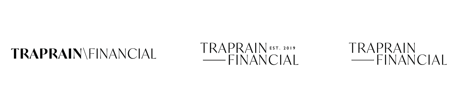
Traprain Financial
Brief
My client was one of the few women financial advisors in Scotland and decided to launch her own women-centred business to educate women on finances. The business name began as RJ Stewart Wealth Management. The style was to have a feminine touch, since so many financial management companies are male-dominated with a dated and often intimidating style. The client later decided she wanted to change her business name and creative direction. Traprain Financial was the name chosen to highlight the local people of Scotland because of Traprain hill near her home. This new brand still focuses on serving her community and feeling approachable, but wanted a more gender neutral and sophisticated look.
Year
2020
Traprain Financial Secondary Options
I focused heavily on creating a visual balance to compliment the services this financial advisor was offering. Financial planning involves life planning, making sacrifices, and sometimes indulging, all in balance.

RJ Stewart Logo Exploration
These were less developed, but were quickly drawn up to provide options which the client would find interesting. I suggested they may not be great, especially at a small scale.


Diamond Collective
Brief
A logo competition entry for a new diamond wholesaler in Australia. They desired a classic ‘Harry Winston’ style logo with bold and sophisticated typefaces.
Year
2020
Secondary Options


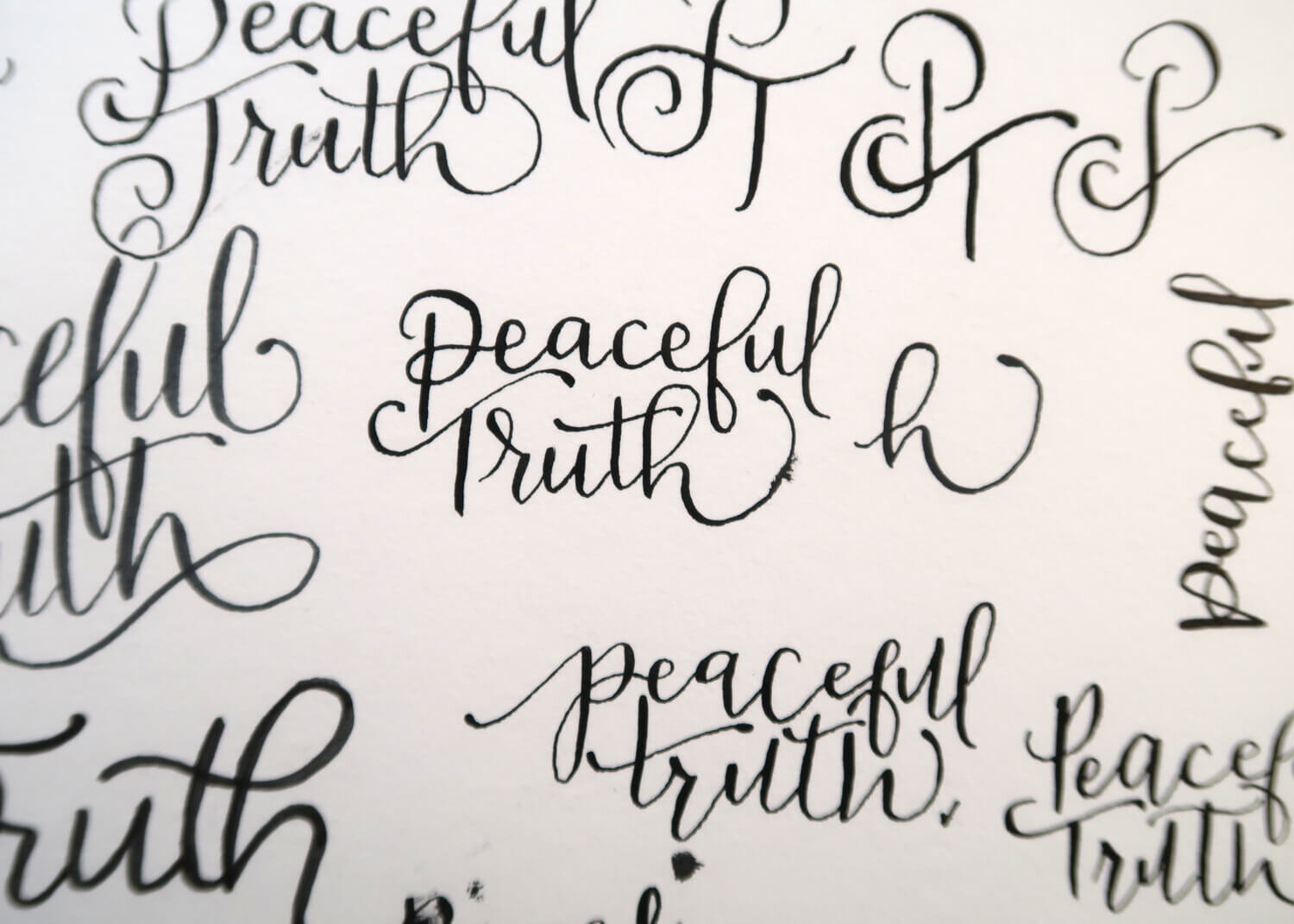
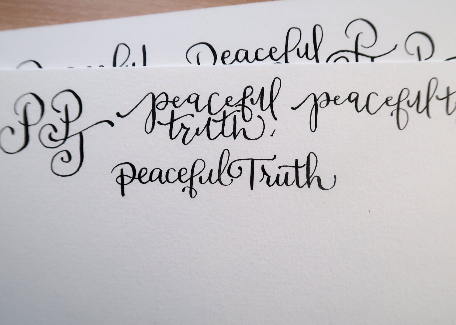
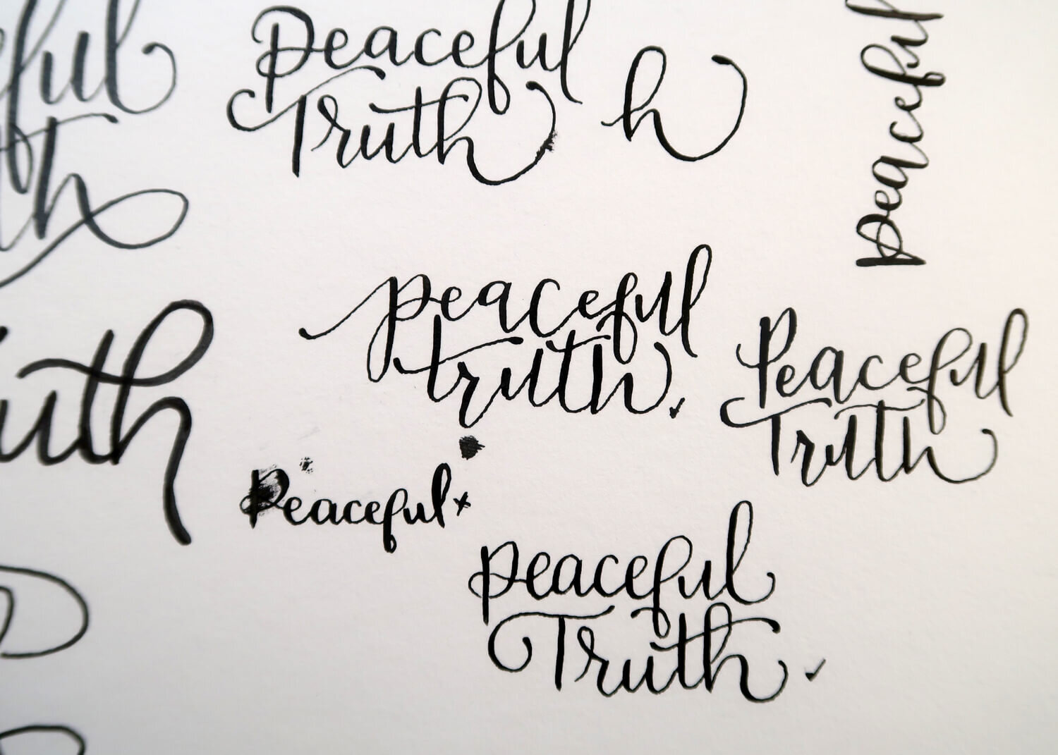
The Peaceful Truth
Brief
I was approached by another designer who wanted to collaborate with me on a logo to utilise my hand lettering style. I lettered various styles of “Peaceful Truth” for him to complete as a logo for a female-led podcast.
Year
2018