Product Discovery
Product Discovery
Signage Redesign
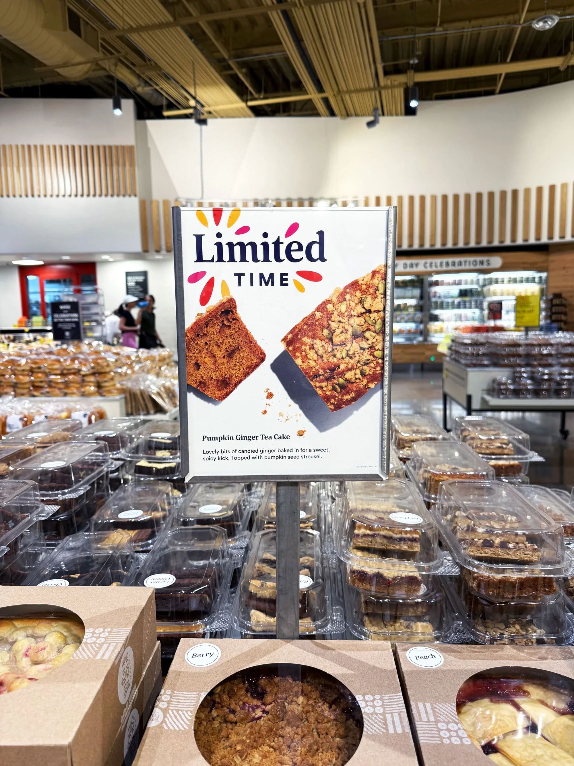
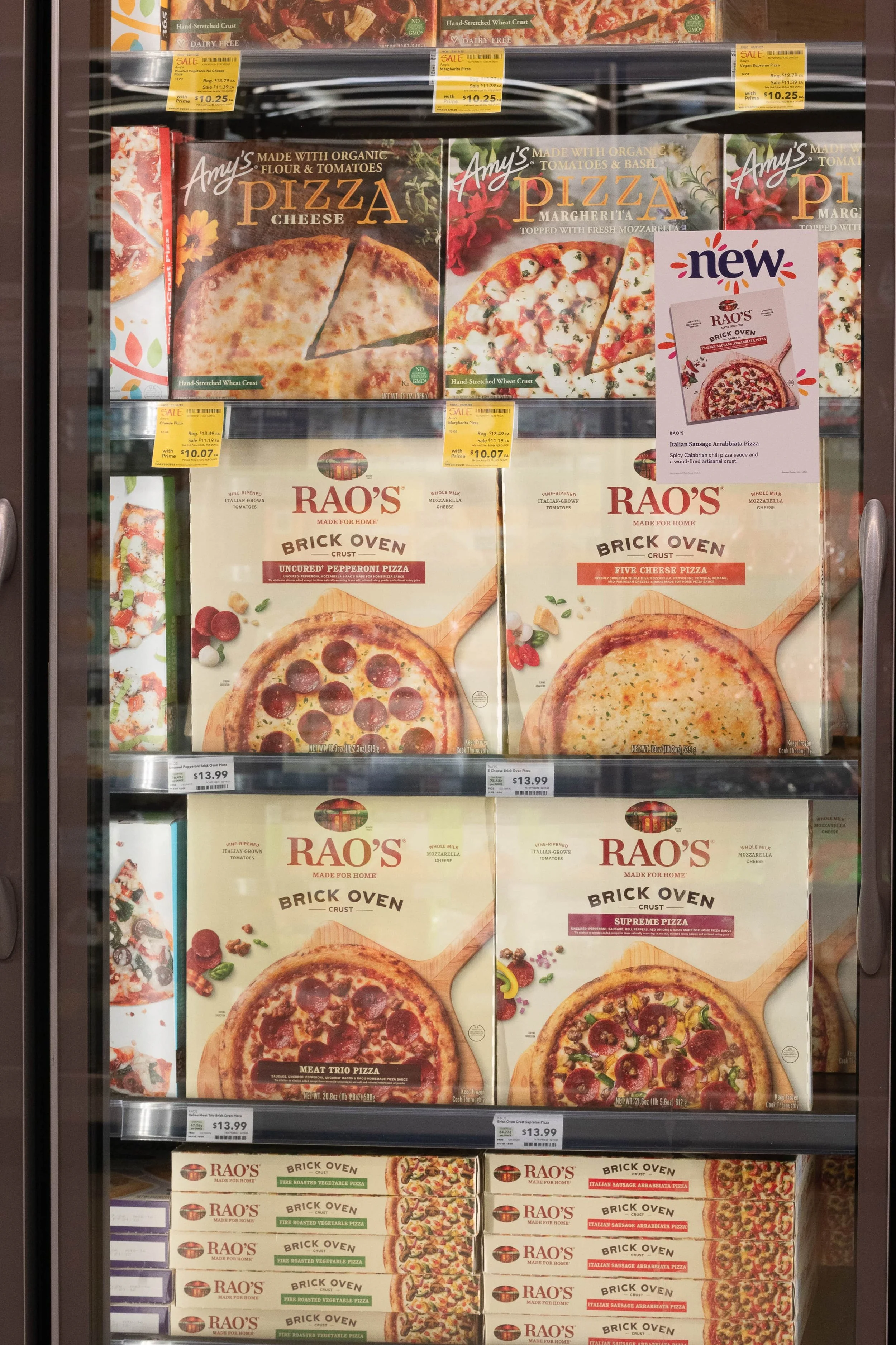
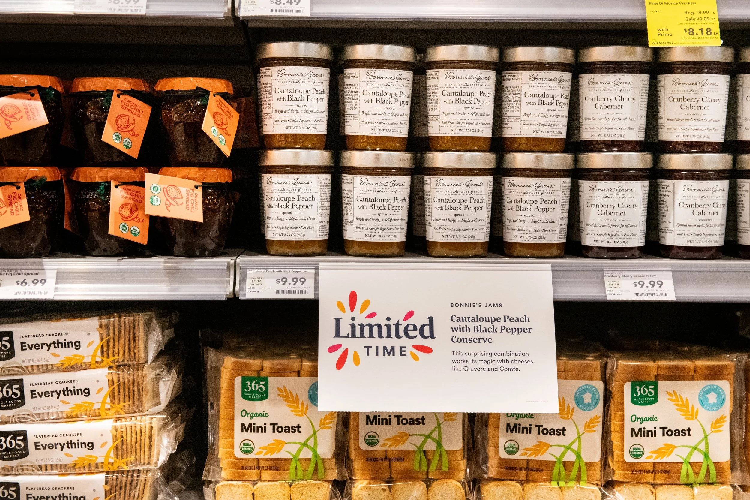
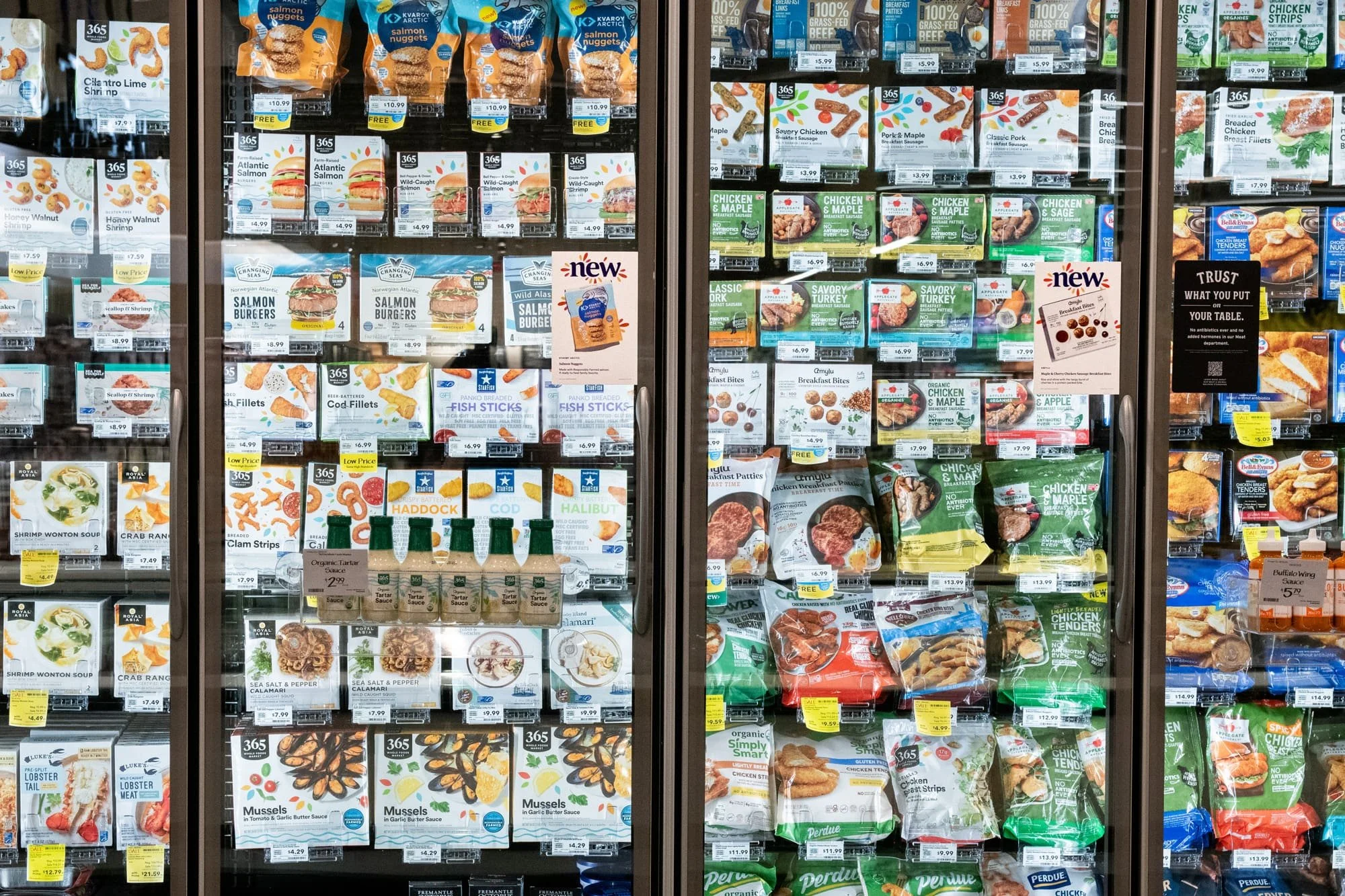
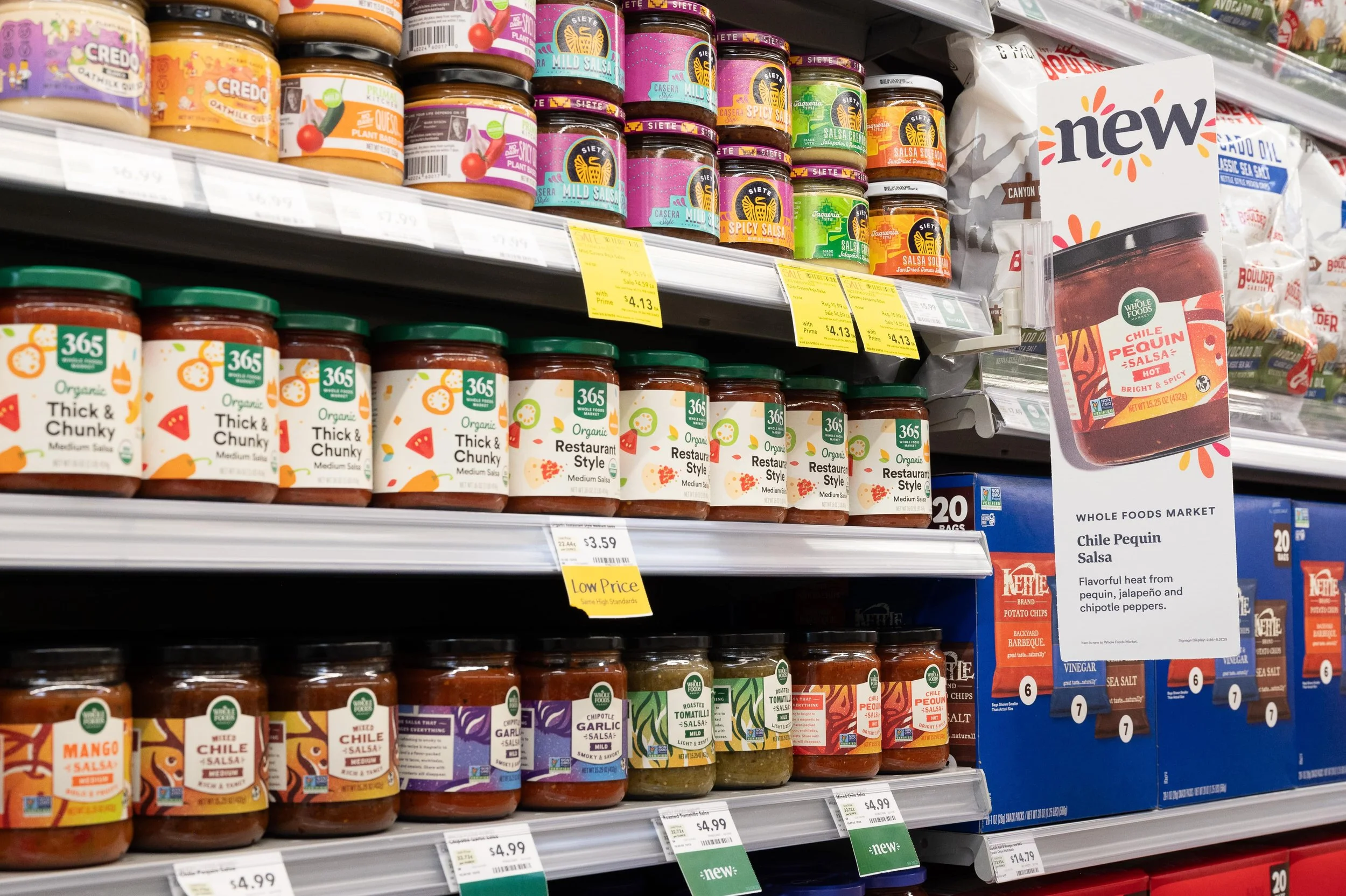
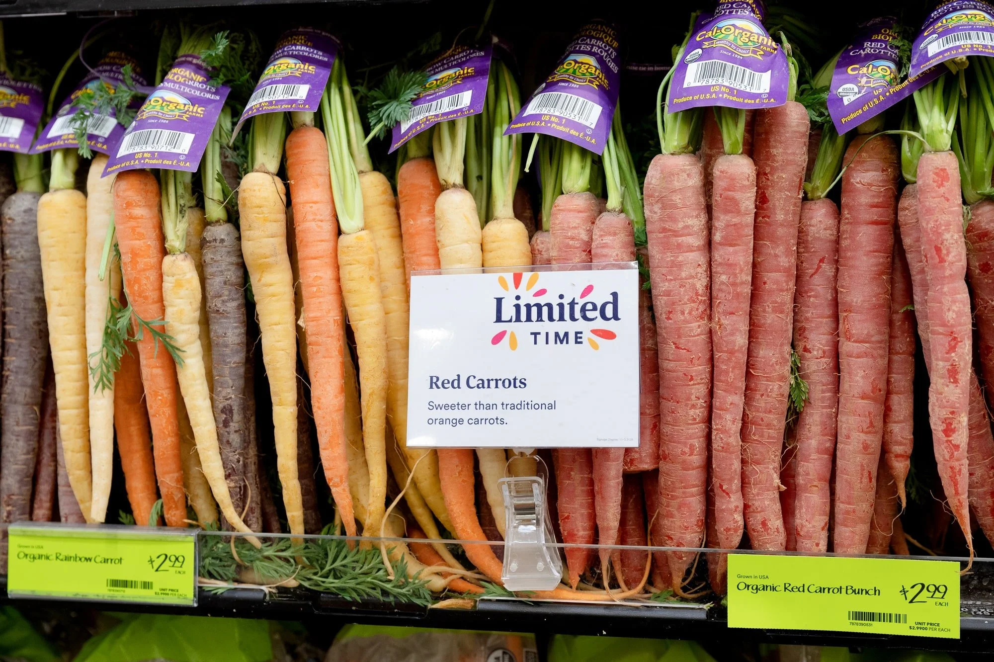
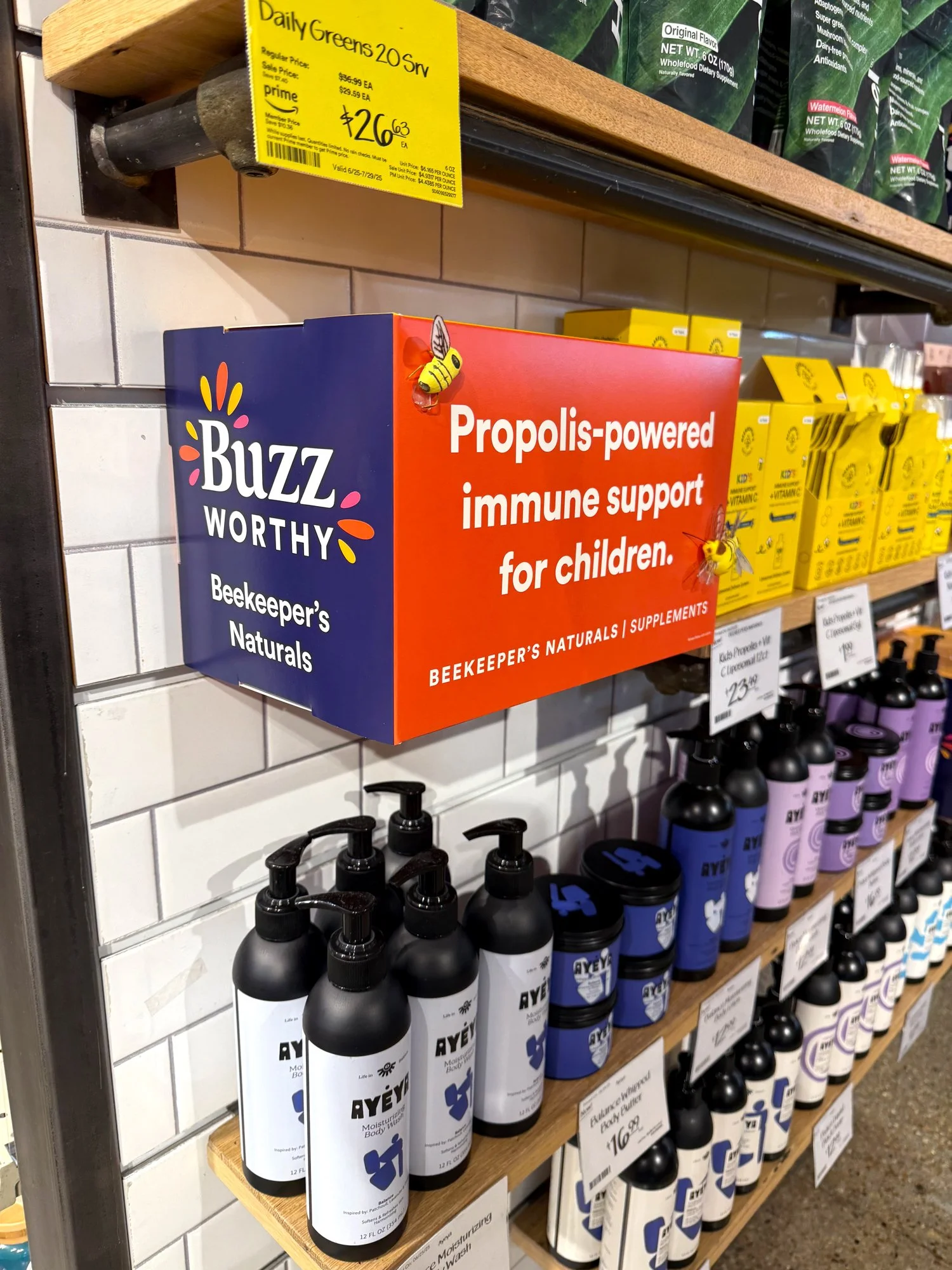
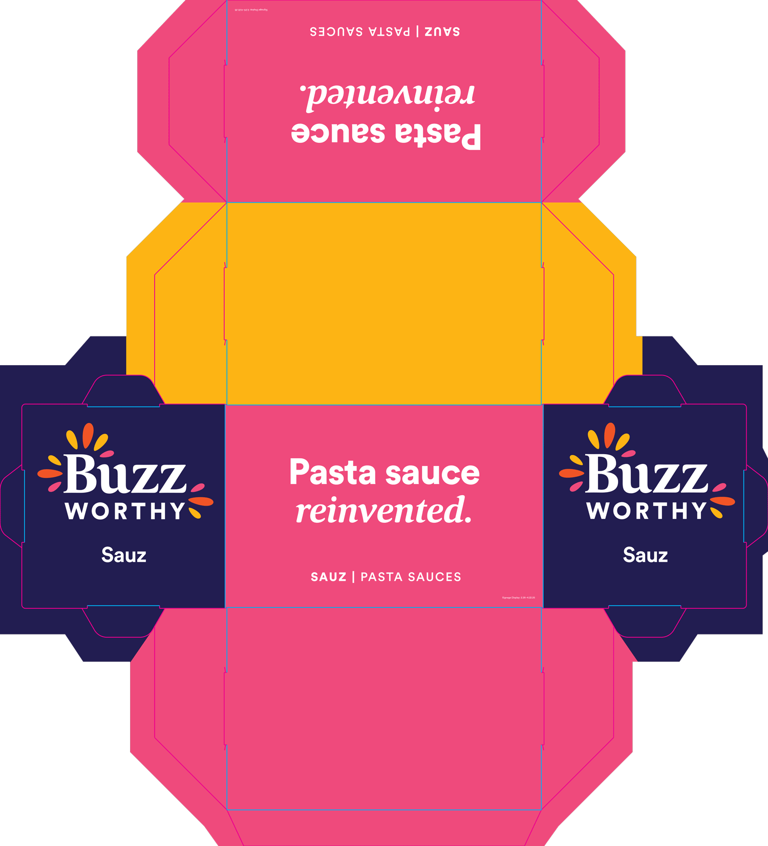
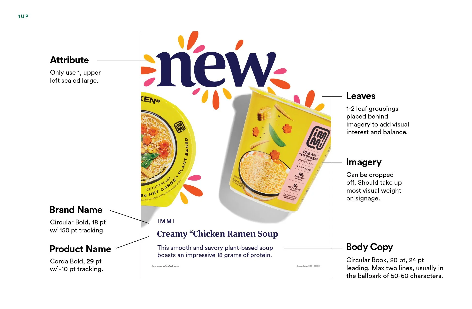
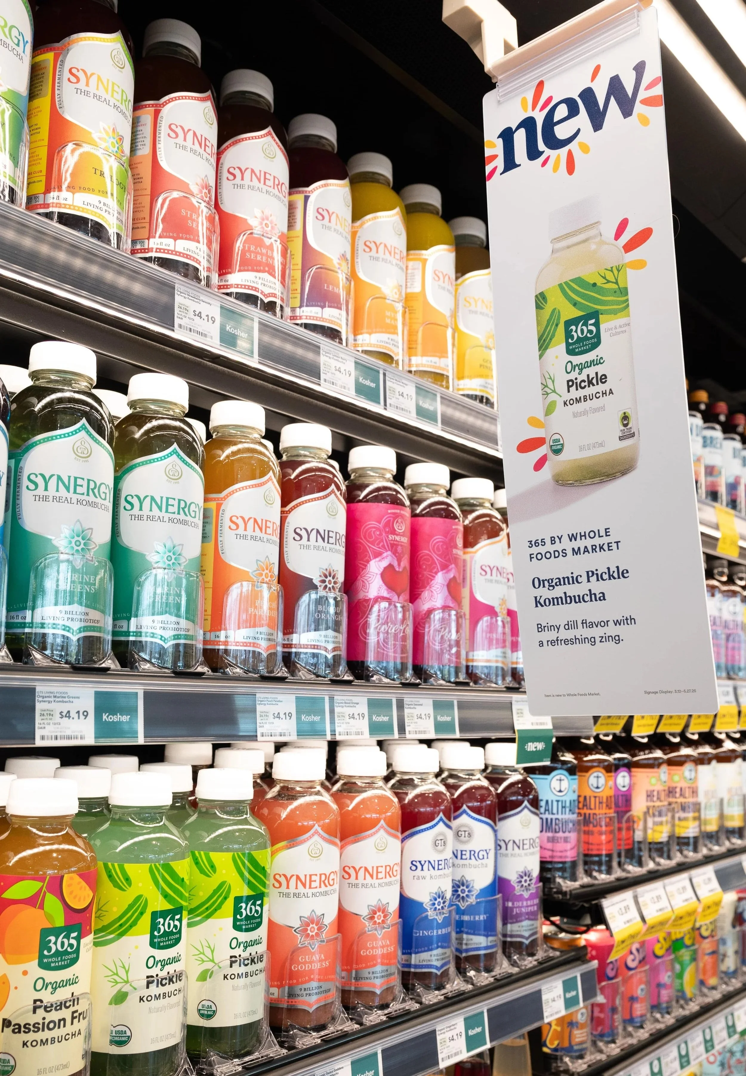
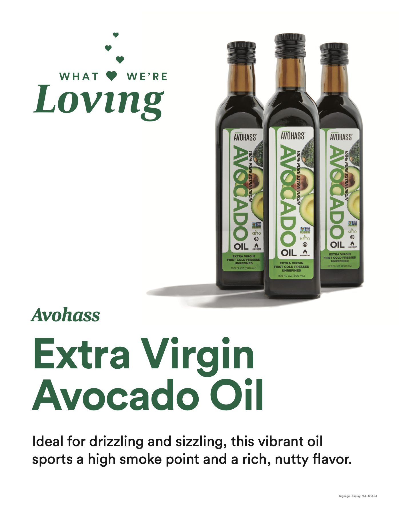
Product Discovery is an evergreen program at Whole Foods Market for over four years highlighting new, seasonal, and unique assortments across the store via wayfinding signage. Each store can feature 10 different signs or more. I created this new design system for the program to revive the look among customer and to improve wayfinding. I also art direct the product imagery for this program.
Year
2025
LOCATION
Austin, TX
Responsibilities
ART DIRECTION | BRANDING & GUIDELINES | LAYOUT
The Program
In-store signage directing customers discover new and unique products at Whole Foods Market.
The Problem
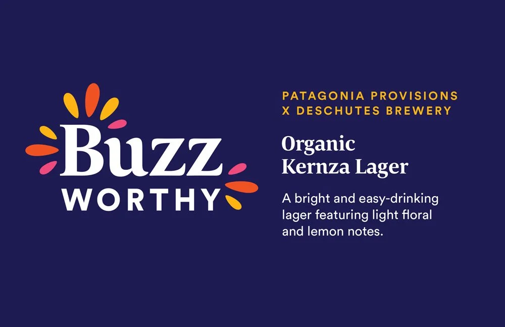
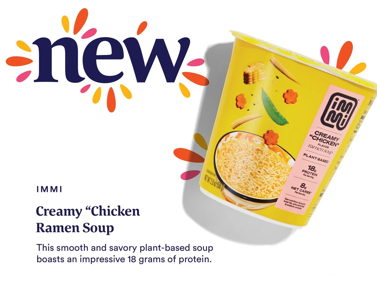
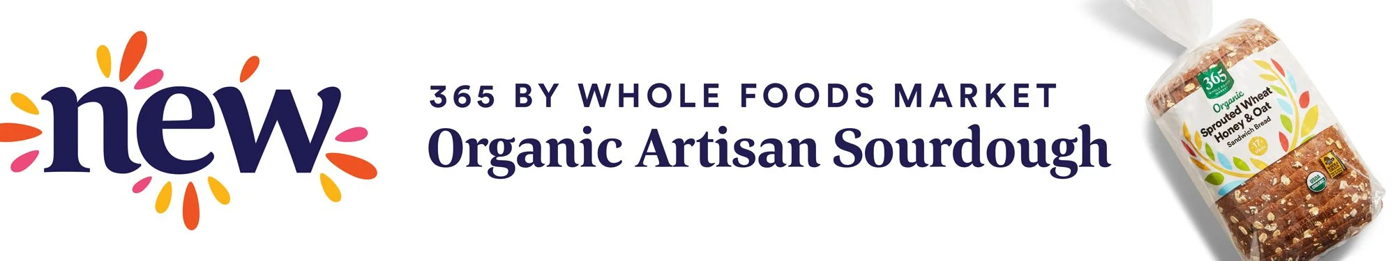
The old signage focused more on the product name, which isn’t exactly helpful to customers discovering this product for the first time. The emphasis needed to be on the attributes. “What We’re Loving” attribute also became a catch-all and not necessarily a unique item. Also, customers were tiring of our single brand green color used across the program, and it no longer stood out in stores compared to our event signage that is brand new every month.
Before

Final Design
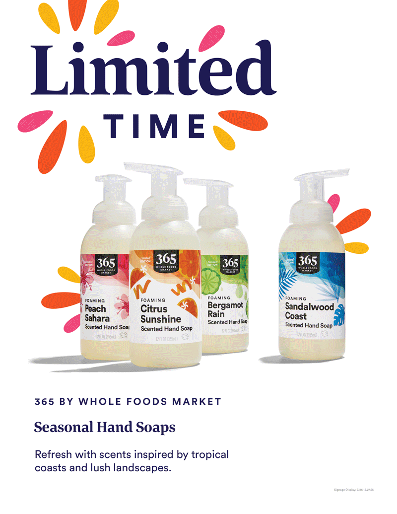
Solution
Clearer, more succinct attributes
Refreshed color system: bright warm hues paired with deep blue
Refocused hierarchy, highlighting the attribute and image first.
Larger imagery
Scaling down brand and product names
Shorter, punchier copy
Additional “jazz hands” graphics to interact with product imagery
More dynamic layering among attribute and image
Overall more fun and exciting as the program should be!