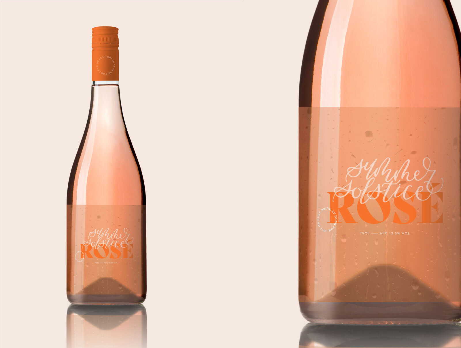
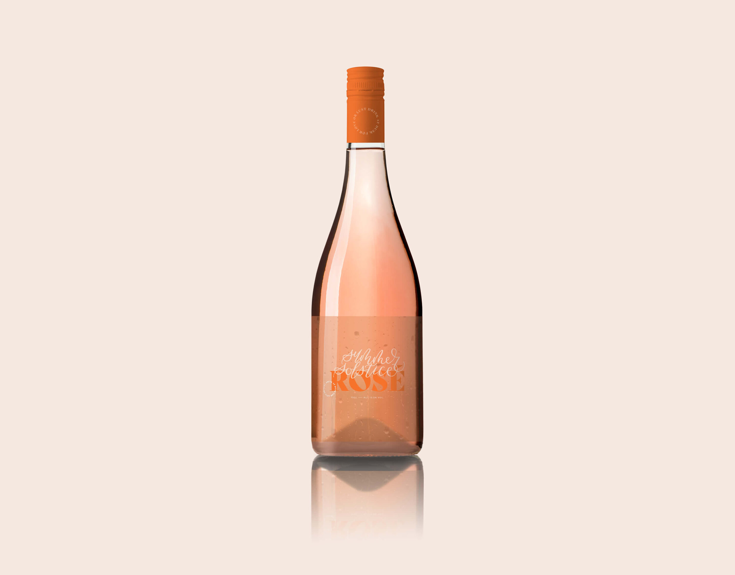
Rosé Bottle Packaging

Summer Solstice
BRIEF
To design a Rosé bottle that captures the spirit of summertime for the Summer edition of Seasons magazine. A label template and mock-up were provided for showcasing entries.
Year
2020
CLIENT
Stories Studio submission for their summer issue of Seasons magazine. They are in the process of creating an online gallery for all submissions.
LOCATION
Barcelona, Spain
DESIGN CONCEPT
To capture summer in what we physically experience. The sun, bright in our eyes that it may create a few wrinkles. The beads of sweat on our back, and always being thirsty. Although these may not sound appealing, these are pleasures that come from experiencing such a raw season. The moodboard below shows my goal of the label, images showcasing boldness in colour and typeface, with a softness of the emotions and handlettering. There is a happiness despite rain, sweat, or lack of comfort. The label is translucent with beads of water, because summer is never dry (and neither is our bar cart). The font choice is bold like the sun or the ocean, but the hand lettering is delicate, like our outfits or hair barrettes. Summer is a juxtaposition creating the perfect balance of bliss.